
Renderosity Forums / Carrara
Welcome to the Carrara Forum
Forum Coordinators: Kalypso, Anim8dtoon
Carrara F.A.Q (Last Updated: 2026 Jul 28 12:52 pm)
Visit the Carrara Gallery here.

Subject: WIP


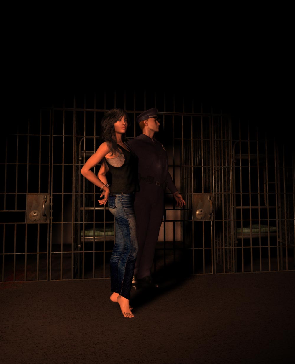
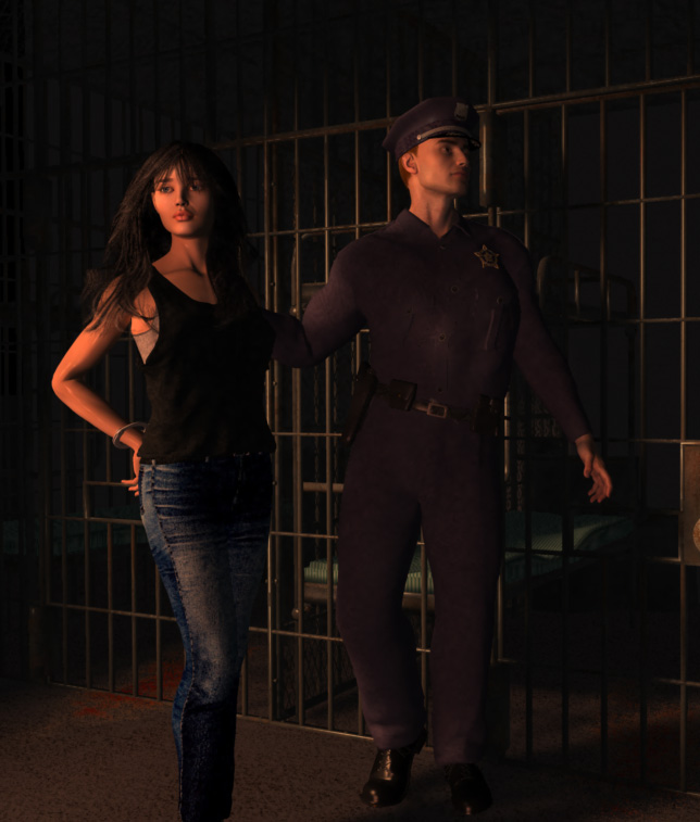
Looks quite good to me Esther. Two observations come to mind: 1. The "ticking" fabric on the jail beds looks shiney or glossy, which it probably wouldn't unless it is covered in plastic. 2. It took me a minute to realise that the rod-shaped object on the small of her back above her handcuffs was actually one of the jail cell bars! It could just be my tired old orbs, but it did confuse me for a moment. I was going to suggest bringing in another dim light source from another angle to make it clearer, but I really like the lighting in your scene. Cheers, Dan
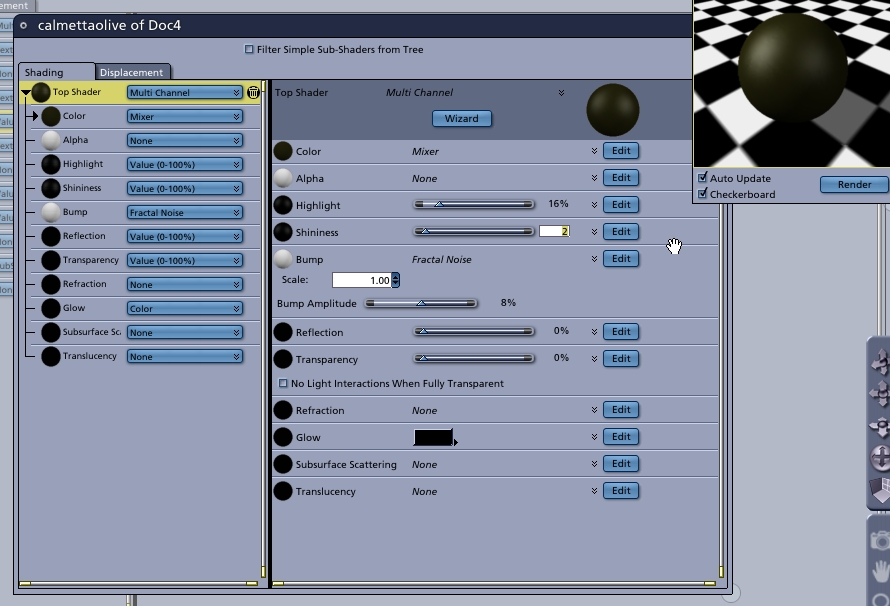
the weird thing to me is I can't find the jailbeds in carrara to change their textures. I can find the actual beds but they don't have the matress on them. Love esther
I aim to update it about once a month. Oh, and it's free!
Aha, i found it by looking in the shaders in the setup room. Love esther
I aim to update it about once a month. Oh, and it's free!

No need to think outside the box....
Just make it
invisible.
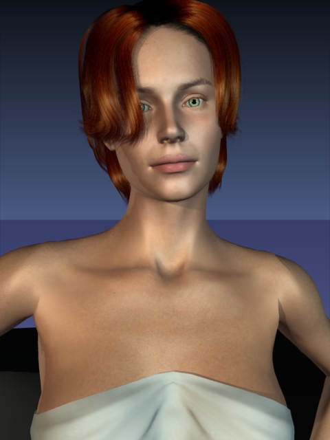
25% shine for skin is less shiney than 7% where it was origibally set - remember it works backwards. Do you think i need to make her skin less shiney ie 50-60% maybe? love esther PS i tried it and it made her arms look rather dull (not in this pick which is still at 25% and black hilghts)
I aim to update it about once a month. Oh, and it's free!
what do you mean by a hilight map? Do you mean just adding a colour to the hilight? Love esther
I aim to update it about once a month. Oh, and it's free!
No need to think outside the box....
Just make it
invisible.
I aim to update it about once a month. Oh, and it's free!

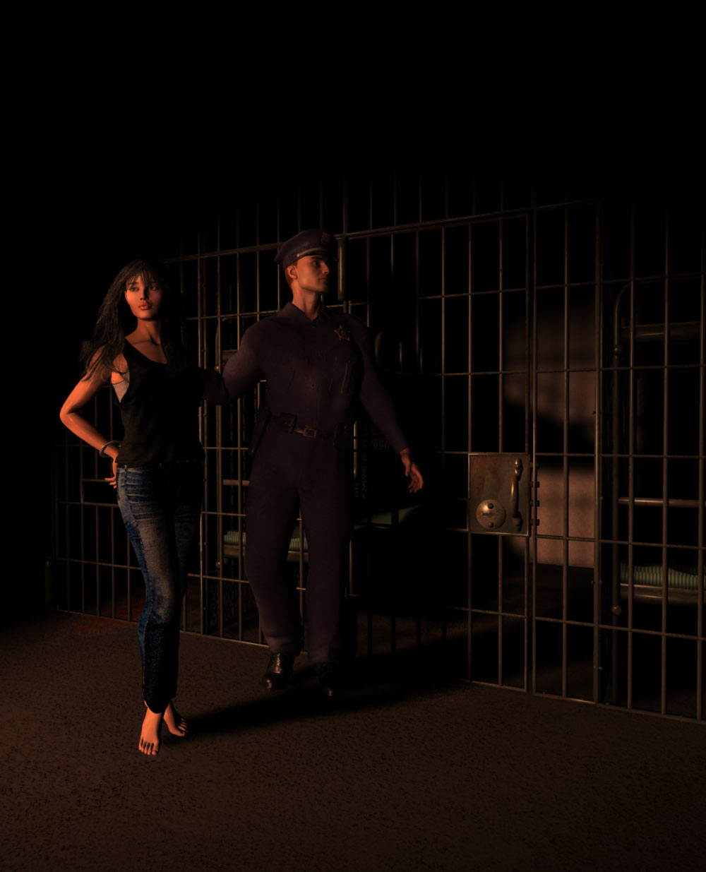
Take 2 does look better. I think you want her looking in your direction as viewer. But I still think it is just too dark to see clearly what you want. They have a power outage :biggrin: The closer in on the facial expressions might also work better. Did you try hdr lighting for more daytime look?
No need to think outside the box....
Just make it
invisible.
I aim to update it about once a month. Oh, and it's free!
I can see al lher hair perfectly clearly. If it's dark you won't be able to see the outer parts of her hair. let me know what you can see. Love esther
I aim to update it about once a month. Oh, and it's free!

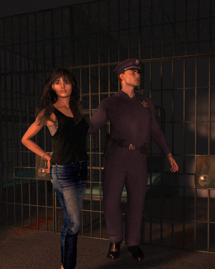
Hi Esther! It is a fun picture that implies a lot of story! 3rd camera is my favorite but I would crop the image as ominousplay says even more so you only see her and the bars, not so much extra. The background is very dark like a curtain in a theater which doesn't help it look real, imo. Jails are more harsh and hard with flourescent lighting or maybe streetlamps through tiny barred windows could help give a sense of depth and some backlight which would help separate her dark hair from the background.... this lighting is very romantic, warm, like a fireplace. I feel it is sending a mixed-message: is she calm and beautiful or is she worried and in jeopardy? I think you could roughen her up a bit. She's had a bad night. Smudge her eye makeup a little. Chew off that pink lipgloss. This is your Angel at her lowest and most vulnerable point in the story. We should be seeing flaws like maybe circles under the eyes...? I'll bet some subtle work on her facepaint would make her more dramatic and believable. Maybe at this point she is numb on zanex, but I think she should be looking a little more worried... or maybe angry. The guard/cop doesn't work for me. He is a Ken doll and his retro uniform looks like a shapeless purple jumper under this light. Please gruff him up a bit too or this scene is more Broadway show than a jailhouse. She is in summer tanktop, he is in winter uniform.... He is anachonistic. I say make him more bluecollar or white-trashy: light blue or khaki uniform with white undershirt peeking at the collar and a little facial hair so he looks older than her.... Or maybe not use him at all, that would be ok too. I don't think he adds anything to the scene. He doesn't seem like a character, just an extra body in the picture. Thanks! That was fun! holly
Hi Esther.
I think Holly made some good points.I can barely see the hair outline. Is your brightness or gamma on your monitor cranked up? I would get rid of the cops hat at least. It does look like something from the 50's. The cop also is looking away and his facial expression is kind doll-like. The lighting really does look like a warm glow from a fire almost. So if it were theatrical...ok. Because it has that dramatic stage look. I am not sure what is going on myself. Have you looked at any jails? Basically, from what I have seen they are flourescent lit, like holly said...however during the day this looks very different...especially with windows.I think the facial expressions will help make things clearer also.
No need to think outside the box....
Just make it
invisible.
Content Advisory! This message contains violence
I aim to update it about once a month. Oh, and it's free!
Looking good. I'd pan left, putting her in the center and the man close to the right side of the image. Zoom in and down. There is too much head room above thier heads. Maybe angle up more, with a POV from knee level looking up. This makes the characters larger than life. Looking down would create the opposite effect. I'd stick her smack dab in the middle with maybe a spot light on her face so the majority of the light is on her. Now, you wrote that she is not the main character... do you want to center on a minor character or the antagonist?
Never Give Up!
Hi, no the girl is the main character. The guy is a cameo character. But it will be a novel cover, so the writing will go in the extra stuff above their heads and maybe sort of on the side that doesn't have as much of the characters, so I thought I would keep the characters to one side maybe? But I could try putting the girl in the middle. And you think angle up then? I don't want to make her look too big though. She's supposed to be tough but vulnerable too. Love esther
I aim to update it about once a month. Oh, and it's free!
I didn't think about leaving room for the title, good idea. Can you Photoshop on the title, author, ect. so we can see the entire image? You are smart to leave room in the render for the writing. I'd still push her over to the left. It gives the idea that he is taking her some place - or he's almost there because he is almost off screen and she is in the middle - stuck in the middle again.
Never Give Up!
Okay, I'll try and put the writing in too just to see and make her in the middle. Does she look too happy? Should I make her frown a bit? Now what about the darkness? Did that look any lighter? Can you see the outer edges of her hair okay or not? Love esther
I aim to update it about once a month. Oh, and it's free!
On my old eMac I can see the hair fine. I like the dark look, and it is lighter. I see the back on the cells fine. Maybe she does look a bit too content. Furrow her brow a bit, a smirk maybe? A "been here before, not staying long anyway... " look might create the mood your looking for. She looks tough, but her smile looks innocent.
Never Give Up!
I wouldn't worry much about the cropping now. You are not really there yet. That will depend on text etc.. anyway. I would focus on the mood. The facial expressions and the lighting. The dark thing is probably a gamma issue. This can be fun w/ displays.Mac taget is supposed to be 1.8 while most shoot for 2.2 on pc. However, if you are calibrated...should compensate. I checked on uncalibrated crt and it was lighter. On calibrated LCD it is still too dark. In this case the LCD can show full color range...not all can. So I bet it is a calibration issue affecting gamma. Higher gamma would wash it out abit making it grayer which would look better to you. The light tho is very orange which has a warm sense...is it intended to be evening? It matters more if you are going to print it. In other words how it prints may be totally different from how it displays.
No need to think outside the box....
Just make it
invisible.
Okay, all good advice. I'll try and print it too and see how it looks on my printer. Well I'm going away for a conference but when I come back I'll have another crack at it. I think I still have a long way to go. You're right ominousplay - "i've been there before, not staying long" is probably the look I'm after. Love esther
I aim to update it about once a month. Oh, and it's free!
Esther,
I would consider maybe her in the jail cell, sitting or arms thru bars. Then you can focus more on her and the mood. Tough mood to convey tho.The cop...at this point isn't really believable and, as Holly pointed out doesn't really add. I did calibrate the crt and it definitely then it got too dark, but as I said, print vs monitors are always going to be 2 different things, sometimes dramatically. If the print is what matters then you want to focus on that. have fun at the conference and on the pic :)
No need to think outside the box....
Just make it
invisible.

I will assume that you did the entire scene in Poser and brought it over to C5 for rendering. I have tried this a few times, but you get much better results if you do just the characters in Poser and the rest of the modeling in C5. The Poser skin system is pretty basic and hard to use compared to C5. BTW I love the image and can hardly wait to see your final version. You may wish to adjust the gamma a bit, it is visible but you can barely make out anything other than about 2/3 of the characters and some glints off the metal bars.
Hi, actually visible on my screen but not as good on my other monitor. well I dunno about the pic, I'm thinking of repositoning the people. maybe what I need for a novel cover is to have the background more lit but with marked depth of field to blur it, and have the light taper off rapidly towards the edges to merge with just black??? I need to play with it again. I've left it alone as I wasn't getting anywhere, but I do need to get back to it again. Someone told me novel cover shouldn't be too busy. So by only doing the characters in poser do you mean you'd texture them in C5? I think I'm not that clever and will have to have the skin as is, but I see what you mean, it doesn't look quite right. However poser skin seems to look okay in other lighting circumstances. Anyway keep the ideas coming, and remember I'm a total carrara Noob. Oh, and feel free to post skin examples etc. I'm sort of at a bit of a dead end with the pics so I need all the help I can get. Love esther
I aim to update it about once a month. Oh, and it's free!
One suggestion on the lighting. If you are generating the jail cell etc in C5, put in a small barred window in the back of the cell, have a shaft of diffuse sunlight come in through it at an angle. This would give the cell some more depth and detail and give you a very nice lighting effect. Check out my latest gallery entry for an example of this kind of effect. http://excalibur.renderosity.com/mod/gallery/index.php?image_id=1253773
I tried to keep the lighting levels somewhat low but keep a bit of detail in the render. Also if you are using C5 for the cell, try adding a bit of displacement mapping to make the bridks or concrete blocks stand out and have some texture.
Just a few suggestions.

Privacy Notice
This site uses cookies to deliver the best experience. Our own cookies make user accounts and other features possible. Third-party cookies are used to display relevant ads and to analyze how Renderosity is used. By using our site, you acknowledge that you have read and understood our Terms of Service, including our Cookie Policy and our Privacy Policy.
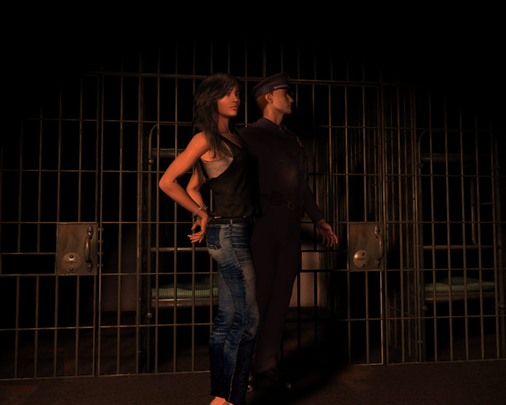
I think this is going to be something like my cover for my Avenging Angel novel. The girl is the main character so I've tried to make her stand out a little bit more with the lighting. For her skin I used 25% shiny, and otherwise just the standard settings that came when I imported her from poser. The hilight looks like it's set to black or almost black. I have zero for all those other funny things like translucence and subsurface scattering that I haven't tried yet. Please feel free to criticize as much as you possibly can. Unlike some other people in the forums I'm not even a tiny bit sensitive and could really use all the help I can get. Love esther PS obviously I'll crop for it to be novel shaped, and probably render more above the people for the wording to go.MY ONLINE COMIC IS NOW LIVE
I aim to update it about once a month. Oh, and it's free!