Renderosity Forums / Poser - OFFICIAL
Welcome to the Poser - OFFICIAL Forum
Forum Moderators: RedPhantom Forum Coordinators: Anim8dtoon
Poser - OFFICIAL F.A.Q (Last Updated: 2026 Apr 10 4:02 pm)

Subject: how to make bump maps?

- 1
- 2

well, if you are using photoshop you could (hypothetically speaking) take your diffuse map, desaturate it, maybe tweak the contrast/brightness levels...but this only works where you have a diffuse map already in use. really depends on your application and/or what you are working on.
light color is a bump, dark is depression.
if you have an exisiting bump look at it and at the diffuse map and you'll see what i'm talking about with desaturation.
hope this helps.
Comitted to excellence through art.
I have no clue what a diffuse map is lol I have bump maps that came with the merchant resource I am using to make my textures but since I have changed so many aspects the bumps that were included no longer corelate with the texture.
I have tried doing different combinations of things trying to achieve what it is that I see in other people's bumps but nothing seems to work out quite right. I was wondering if there was a formula that one follows in order to make them. If it is simply a guessing game then I suppose I will have to keep experimenting.
...I try to take it one day at a time but sometimes several days attack me at once...

Take your texture map (the one connected to the diffuse channel) into PS and gray-scale it (desaturate). Then you can tweak the contrast/brightness until you come up with a good map. Like DarkEdge said, lighter is the bump part, darker is the depressions.
This is all I do for my bump maps and they work really well. I use PS CS2 for these.
Hugz from Phoenix, USA
Victoria
Remember, sometimes the dragon wins. Correction: MOST times.

AllI ever do is take the image into my graphic program and make it into a grey scale image using one of the options in the drop down menus. Then save it with the same file name as the texture with "BUMP" in the name. I save it as a .jpg.
"It is good to see ourselves as
others see us. Try as we may, we are never
able to know ourselves fully as we
are, especially the evil side of us.
This we can do only if we are not
angry with our critics but will take in good
heart whatever they might have to
say." - Ghandi

The advice above is technically correct, but not ideal.
Converting standard textures to bump maps can yield innapropriate results.
There's really no easy way to make a GOOD bump map, or displacement map for that matter (a much neglected area).
The options above can certainly work in many cases, don't get me wrong. They're just not a cover-all solution.
If we can hit that bullseye, the rest of the dominos will fall like a house of cards...checkmate!

Photoshop is ideal for what you want to do. With photoshop; click the Color Picker, set the Saturation(S) to 0, and set the Brightness(B) to 50. Now you have a Perfect Grey. If you were to fill the top layer of your texture map with it, and then plug that image into your Poser Material Room Bump or Dissplacement nodes, this Bump Map would do absolutely nothing...
Conversely if you were to then paint certain areas of that layer with bright grey or white, then(depending on how much brighter than grey that color is, and what value you have set in Bump or Dissplacement Value nodes) you will raise the surface of your figure.
Painting areas with dark grey or black lowers the surface of your figure.
The difference between Bump and Disspalcement is that Displacement will actually change the shape of your figure's mesh. A bump is just an effect that happens during rendertime. DIssplacement is more of a chore, it will cost you rendertime; so I think you use Bumps for subtle change, and Dissplacement for more dramatic ones.
The funny thing is, from Poser 5 onward the standard desaturated/inverted bump map is totally unnecessary. It only takes up texture memory.
Drag a line from the texture map node output to an empty space in the material room. Choose node type Math->Math functions.
Choose function type Add (the default), set the upper value to -1 and the lower value to 1. Click on the eye icon, and you'll have your inverted grayscale map. Now connect the output of this node to the Bump channel, set an appropriate bump value, and you're done.
With a texture of 4000x4000 pixels this will save you a LOT of memory when rendering - don't forget that a texture map will be uncompressed in memory!
The pen is mightier than the sword. But if you literally want to have some impact, use a typewriter

Quote - Drag a line from the texture map node output to an empty space in the material room. Choose node type Math->Math functions. Choose function type Add (the default), set the upper value to -1 and the lower value to 1. Click on the eye icon, and you'll have your inverted grayscale map. Now connect the output of this node to the Bump channel, set an appropriate bump value, and you're done.
svdl: Wow, that's wonderful. That's the kind of stuff that's makes coming to this site fun.

Yes, what svdl said. I just discovered this technique recently and it works better than creating in Photoshop, believe me. :) Now that i have P7 I am reading all the tutorial material on realism and this is in there. I tried it out and , Wow! Now I have a question as well, what is the best setting (number) on the bump maps? I notice in P7 that you have to be very careful or your texture looks like it's exploding.
Let me introduce you to my multiple personalities. :)
BluEcho...Faery_Light...Faery_Souls.

Attached Link: http://www.onona3d.com/tutorials.htm
I'd just like to add in here that ClawShrimp is correct. The best way is to paint it as a separate map, to be honest. These other methods work but not always and not always well. You should take a look at Texturing For Dummies by Leigh Van Der Byl. Handy info there (not to mention free). See attached link.A great book for texture artists is Digital Texturing and Painting by Owen Demers. ISBN : 0-7357-0918-1

Quote - I'd just like to add in here that ClawShrimp is correct. The best way is to paint it as a separate map, to be honest. These other methods work but not always and not always well.
very true..simply desaturating or inverting a color map wont create a decent bump map.that's a method to avoid if your looking for fine bump mapping
another link:
http://forums.cgsociety.org/showthread.php?f=46&t=339508&highlight=skin
Angelouscuitrys comment:
* "Now you have a Perfect Grey. If you were to fill the top layer of your texture map with it, and then plug that image into your Poser Material Room Bump or Dissplacement nodes, this Bump Map would do absolutely nothing..."
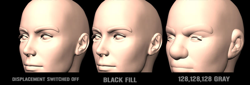
applying a gray shade to displacement will have an effect,if you want no effect then use black,most 3d apps use gray(128,128,128) as the base level,meaning it has no effect,but Poser treats black as the base level,this can easily be changed via nodes but by default black is the shade that has no effect on displacement
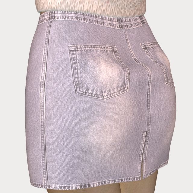
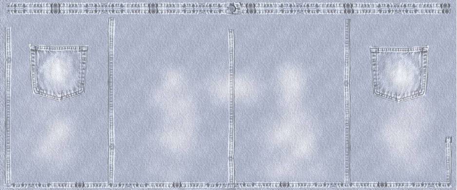
Yes and it shows exactly the problem with doing bump maps from desat color maps. If you look at the seam in the center of the back of the skirt, you will find that it is actually reversed from what it should be. ie the bump map has gotten its dips and bumps flipped.
No offense to anyone, but this is a quite common problem and i wish more merchants would actually take the time to learn to do proper bumps. Too many times i get bumps like this that i have to go in and manually correct which is not something desirable on a deadline.
Quote - If you look at the seam in the center of the back of the skirt, you will find that it is actually reversed from what it should be. ie the bump map has gotten its dips and bumps flipped.
I hadn't noticed that before, tekmonk, and I'm not clear why it should be. You can see that the seam is a light area on the bump map, so it should appear to be sticking out, as the side seam does. This is a Poser 4 render, and I believe I corrected the map according to my tutorial, so it's a puzzle. Maybe P4 has trouble matching up the bump map when it comes to a UV seam.
I really wish there was a clear cut formula, at least then all us merchants could get it right. I envy those who have found their "tricks of the trade" in this area.
Thank you all for your responses and sharing your knowledge as well as links! I will go back to the drawing board and hopefully be able to put some of this info to good use.
...I try to take it one day at a time but sometimes several days attack me at once...
Quote - I hadn't noticed that before, tekmonk, and I'm not clear why it should be. You can see that the seam is a light area on the bump map, so it should appear to be sticking out, as the side seam does.
Its because for the texture map, you have created one side of the texture then mirrored it for the other side, then copied one of the seams on the middle. This works fine for textures, cause textures don't affect lighting of a material. But bumps are different. When you flip/mirror a bump map, you are also mirroring the direction of light that created that bump. So when you render a bump map that has this sort of conflicting light in it, the odd parts will look reversed from the rest of the image.
Its easy enough to fix, but not if you only rely on the texture map.
tekmonk, does this mean that the mirroring would NOT adversely affect a displacement map?
And does it also mean that different lighting requires different bump maps?
The pen is mightier than the sword. But if you literally want to have some impact, use a typewriter
Getting dents with displacement maps isn't difficult. Just don't plug the map directly into the displacement entry of the root node. Feed the map output into a Math node, set to Subtract, and subtract 0.5.
This is for displacement maps, NOT for bump maps!
The pen is mightier than the sword. But if you literally want to have some impact, use a typewriter

With displacement maps Stonemason is definitely right. Black is the null value and white is the highest value, it works more on a mask system than on a greyscale system. All tones of grey between black and white have varying effects on the output depending on the closeness of tone to either end of the scale.
The reason a flat 128,128,128 map when connected to the bump and the displacement appears to have no effect is simply because you are applying a flat plane which will effect all parts equally, thereby negating it's effect. Further painting onto this map with varying shades of grey will giive an unholy mess as it then reads the 128,128.128 as a displaced area and off it goes. Displacement in one ares has a knock-on effect in surrounding areas even if they are "masked" out by the black base.
Yes, I am currently trying to teach myself how to get the best from displacement mapping by the time honoured method of trying it and making a right mess but it is slowly coming together and the first thing I learnt was that only black will do for areas you do not want any displacement showing.
From my few experiments svdl I have found that displacement mapping is far more reliable and accurate than my bump maps and, no doubt because it deforms the actual mesh into that shape, it behaves more realisticlaly under any lighting than a bump map ever will.
If you aren't afraid of the materials room, you could add a math functions node, plug your diffuse image map into value 1 and set it to abs. Then you have a greyscale. You could also set it to bias and play with a range of .1 to .9 for the second value. You can also get a good effect out of adding a noise node for the second value and play around with values between .25 and .75 for min and max.
Noise is a complete STAR when it comes to displacements and need a slight fuzz to it, or a short furry(ish) effect depending on how you route it through to the displacement node. I haven't got too far into this as I'm learning by trial and error and just trying stuff to see what does and doesn't work and what some of the functions do. The math function will be my next toy. Now we all know why I haven't had any new product out, I am too busy learning and having a blast in the process!
*Ask and you shall receive!
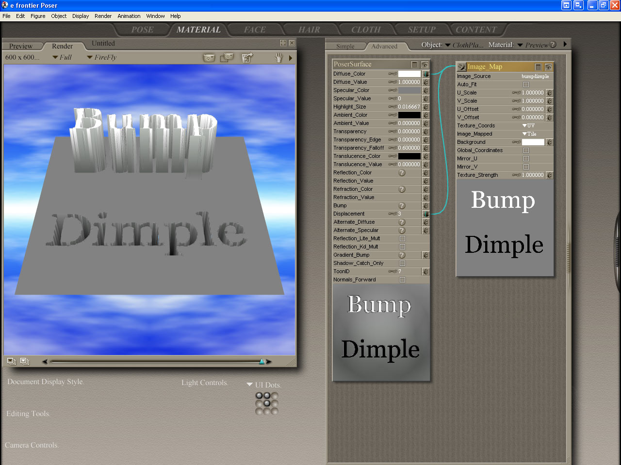
The object being Dissplaced is a flat High-Res Square Primitive Prop.
StoneMason, and Valerian70 - One day, after a lot of work, I was giving advice in a renderosity thread; about Bumps. What I was saying Bumps/Dissplacement, is what you are saying about Transparencies. Then someone was kind enough to articulate the difference. The way it is made sense, and I promised myself I'd never confuse the two again. Here is my opportunity to test, and repay the community for what I'd learned!
Interesting test render.
Now try this: select the flat plane, open the Grouping tool, create a new group (name doesn't matter) and select about half of the polygons. Choose "Assign material" and enter a new material name, e.g. "Flat"
Now the plane has two materials, one half has the "Flat" material, the other half has the "Preview" material.
Set up the displacement shader for the Preview material as you did, and leave the "Flat" material as it is.
Render, and you'll see that the "Dimple" will neatly line up with the "Flat" part of the plane!
The pen is mightier than the sword. But if you literally want to have some impact, use a typewriter
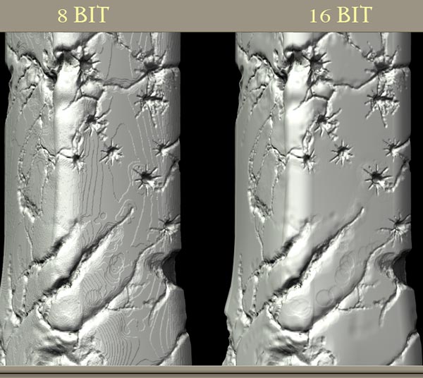
or another test,fill an image with 128,128,128 gray & apply that to Viki to create the Michelin girl..then do the same with a black fill & see no effect..the difference is very apparent
I would also note this isn't how I do my displacement,I use zbrush to generate upper & lower images that when combined create a 16bit rendering effect
example files here:
http://home.xtra.co.nz/hosts/polycount3d/Free_HellColumn3.htm
that is the whole material room..at least that's the only node that's being used,the final render of that node setup is in the post above
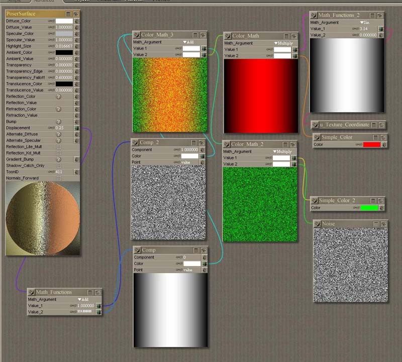
stonemason: wouldn't it be possible to encode the lower 8 bits into a red channel and the upper 8 bits into a greenchannel, and then use Component nodes to combine them into a 16 bits displacement effect in Poser?
The pen is mightier than the sword. But if you literally want to have some impact, use a typewriter
hmm...go on then,show me how :-)
I have heard of other methods to do this but I've never had much luck with it myself...if you can show a method that doesnt require zbrush I'd be very gratefull,
I'm not clued up on how to seperate the channels
this old thread explains one way of doing it in photoshop
http://www.renderosity.com/mod/forumpro/showthread.php?thread_id=1740708
& another at rdna that might be relevant:
http://www.runtimedna.com/mod/forum/messages.php?forum_id=92&ShowMessage=274774
& while your playing around with channels..how would you go about using an image that has an embedded alpha channel?..what kind of node setup is required to pull that alpha out of the color map
The pen is mightier than the sword. But if you literally want to have some impact, use a typewriter
And here's how I did it. Pure red for major, pure green for minor.
The pen is mightier than the sword. But if you literally want to have some impact, use a typewriter
Sorry, the settings image was too large for 'rosity, and Photoshop decided to act up. Will post the settings image ASAP.
I'll see what I can do with your HellColumn. A side by side render will tell if my idea works.
The pen is mightier than the sword. But if you literally want to have some impact, use a typewriter
The pen is mightier than the sword. But if you literally want to have some impact, use a typewriter
yea,with so much noise in that image I think it's impossible to tell if it's rendering as 16bit
A couple of things are hard to read.
The two colums on the right hand side are used to generate a "red" map and a "green" map, they're combined in the upper left node.
The two Comp nodes separate the red and green channels: a Component value of 0 means red, a Compnent value of 1 means green. The color swathes are pure white (255,255,255).
The outputs of the Comp nodes are added using a straightforward Math -> Add node, one input set at value 256, the other at value 1.
The pen is mightier than the sword. But if you literally want to have some impact, use a typewriter
if your doing all this via procedurals..I think most of Posers procedural functions render as 16bit anyway...I'd love to see you try it with a bitmap if possible
- 1
- 2
Privacy Notice
This site uses cookies to deliver the best experience. Our own cookies make user accounts and other features possible. Third-party cookies are used to display relevant ads and to analyze how Renderosity is used. By using our site, you acknowledge that you have read and understood our Terms of Service, including our Cookie Policy and our Privacy Policy.
I have been looking through tutorials and forums and cannot find an answer so I hope someone here can help me out :)
I am not sure what the steps are that I am supposed to do in order to create a proper bump map. I am using Photoshop 7 so if someone has experience making bumps with this application it would be of great help.
Thanks! Sasha.
...I try to take it one day at a time but sometimes several days attack me at once...