
Renderosity Forums / Carrara
Welcome to the Carrara Forum
Forum Coordinators: Kalypso, Anim8dtoon
Carrara F.A.Q (Last Updated: 2026 Jul 11 2:50 am)
Visit the Carrara Gallery here.

Subject: Playing with photos for backgrounds


I think you could go either way meaning I like the more abstract colored background for one look. This one I like, but I think the background is a bit too washed out. The tree particularly is too hazy and washed out for that depth (a bit grainy too). Would also try some purple in the sky even if it is very subtle because it is tertiary to your green in the foreground and you want to bring the eye around even tho you want it clearly to be the background. Nice tho. Are you putting a border on them in photoshop before printing them?
No need to think outside the box....
Just make it
invisible.
Thanks for the advice. I am putting a white border around the image, helps for printing. I'm trying to get Kinkos to print it the same size every time so I don't have to adjust my matt cuts every time. I agree with the washed out look, but I wanted the bird and willow to stand out. I also fear the tree it growing out of the poor bird's head a bit, but I'm too lazy to go take more photos... I probably need to.
Never Give Up!
I don't feel like the tree is growing out of the head. You could try a little different position tho. Is the noise from processing or was it a noisy image of the tree? What ISO are these at? You might try playing with your F stops to see if you want the tree to have more depth or be flat like it is now. Sometimes you gotta play. :biggrin:
No need to think outside the box....
Just make it
invisible.

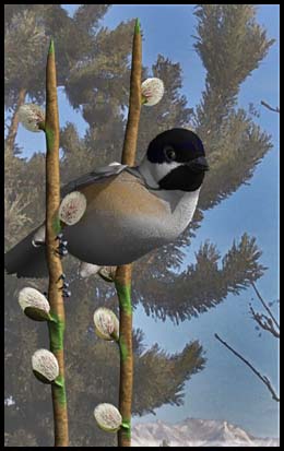
You know, I do too : ) I though about it, when you increase the canvas size, it takes the second (background) color and makes it the rest of the canvas - so I usually set it to white. In this case, it is black. I pulls out the black head and shadows. I'll have to play with the shadows - looks like you painted some darker tones - maybe a light dodge? I plan on matting it with a dark green and light brown to match the willow branch, and a black frame. I'll post it when finished. Thanks for the image ideas, nice to see my art adjusted - picture worth a thousand words.
Never Give Up!
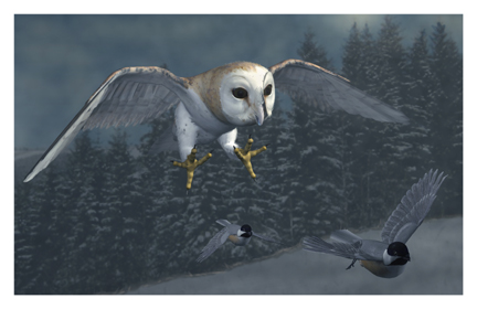
That's nice. Is that Noggin's owl?I actually like both borders. Depends on the picture. While the bird looks a bit better, I think you could also adjust your lighting for this. I don't like the dodged background tho. (at least that is what it looks like.) I would actually tweak the textures on the bird to give it a little more gloss, on feathers and eyes.
No need to think outside the box....
Just make it
invisible.
Ominousplay, all the tonal variations were done, only, with the PShop Shadow/Highlight thinghy.
For imagerey I think this "PlugIn" is the VERY best thing since sliced bread. The very first thing, after rendering an Carrara image, is to first adjust levels if needed and then, without fail, experiment with that shadow/highlight. Have not yet found an image that has not benefited from it.
bwtr
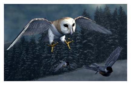
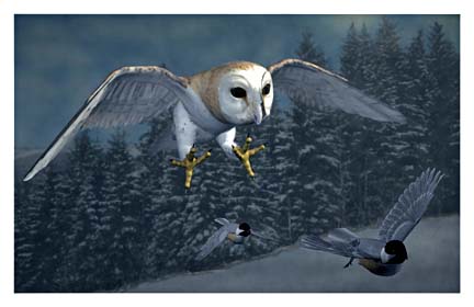
Always manually--basically, 90% of the time it's just to bring the R and L sliders into the proper out side edges of the main graph features. Very occasionaly I will make a slight change to the middle slider. I always work on a duplicate of the file so that I can switch it off and on to see my visual result.. With the Shadow/highlight, I usually do a duplicate of the duplicate to work on--for the same reasons.
bwtr
I like the darker shadows, but the way it prints keeps me from making anything too dark - it prints darker. Buy my origional image looks very drab and washed out - unsaturated. I'll play with my photoshop settings. Yes, Noggin's owl, great pack! And the song bird pack. The birds are coming back to AK. And we are also the first stop for - the Bird Flu! Can't wait! Might be the first on my block to get it! Even more exciting than... the Daz/ Eovia merger.
Never Give Up!
Epson does printers well. I had the first color inkjet (hp) and the first epson color inkjet. OP the 2400 Epson also uses the k3 inks used in the 4800's on up at less than a $1000 13" wide (around $800). The 1800 uses the ultra-chrome very similiar inks even cheaper ($500 area).(13" wide) I think too.
No need to think outside the box....
Just make it
invisible.

Privacy Notice
This site uses cookies to deliver the best experience. Our own cookies make user accounts and other features possible. Third-party cookies are used to display relevant ads and to analyze how Renderosity is used. By using our site, you acknowledge that you have read and understood our Terms of Service, including our Cookie Policy and our Privacy Policy.
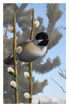
I've been playing with Photoshop to distort photos and use for backgrounds - comments appreciated. RNever Give Up!