Here are some examples of bad placement of text on Product thumbnails:
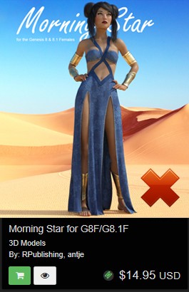
This thumbnail hides half the text behind the product. This will not work for good product promotions.
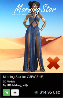
The text is covering the product itself. This will not work for good product promotions. The product should be the focal point of any promotional image.
So, where do you place text on product thumbnails?
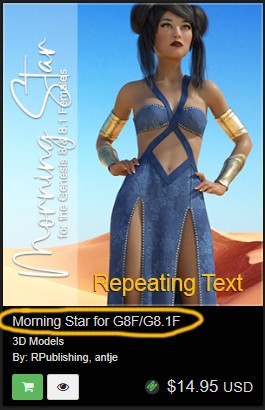
The text on the image is seen being done quite a lot in the MarketPlace, but there is a mistake in the thumbnail above. The image is repeating text information that is already being shown below in the product description.

Based on our product description the thumbnail requires no text at all. The entire product is being shown, and the product itself is the main selling & focal point of the image.
Comments