


















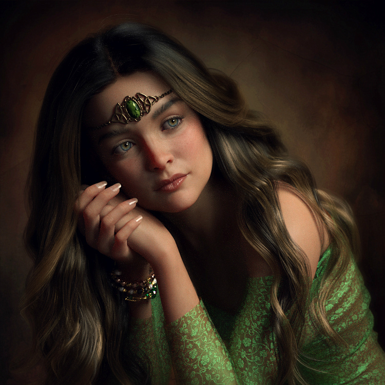
Mira by Pepsel
Close
Hover over top left image to zoom.
Click anywhere to exit.
Members remain the original copyright holder in all their materials here at Renderosity. Use of any of their material inconsistent with the terms and conditions set forth is prohibited and is considered an infringement of the copyrights of the respective holders unless specially stated otherwise.
No AI - This artwork was created entirely by hand or with traditional digital tools.
Description
A Happy New Year, with lots of creativity, love, happiness and good health for all of you!!
(Question to you all; I notice that my renders look so much darker on my mobile phone...do you have that problem to?They look so much better when i see them on my laptop...)

Comments (19)
Beautiful, stunning model - images are going to look different from device to device, I have no issue and do not find them dark but I may not know what your original looks like as my setting and age of my monitor any be different. I find your work to be quite visually pleasing. Wish I had a way to screen capture your image and show you but don't have a place to put it.
It is very pleasing and relaxing to view. I love the fabric details, the lighting, and the composition.
..one more time a real beautiful "classical" portrait and excellent pose
Beautiful! A render that reminds me of master paintings.
Your art is full of sensibility. Pose, lighting, materials, character, background...Everything is perfect. So, I agree with fireangel.
This is a great piece and it is moody but not too dark on my monitor. I love the pose, the softness and the lighting.
The problem is where you have your computer brightness set. If it is too bright, and your images are adjusted for that, then they will look dark on other machine. There is an industry standard that Photographers use to avoid this. The color temperature on your display should be D65 and the Luminence set to 120. Most monitors with the brightness turn fully on will be around 300 - 400 Luminence. FYI: my monitor is callibrated to D65, 120.
Awesome !
Absolutely gorgeous portrait! Wonderful realism. Happy New Year!
absolutely beautiful portrait
Breathtaking.
Beautiful portrait.
Great realistic portrait and excellent light!!👍🙋♂️
Soft and beautiful, lovely work! 👌😊
Very nice. Followed the comments regarding darkness as I've run into these issues myself. My display is currently set to default and the lighting and darkness on your image are pretty much spot on. Wondering if the issue arises with artists having photography training or backgrounds with more discerning eyes following norms to which they are accustomed? As far as phones go - mine is to call if the car is on fire or to take eBay photos. Art is for the big screen...
Wonderful contemplative portrait, really engaging. Lovely palette and textures throughout.
Another thing to mention wrt darkness; pixel density and the quality of the monitor/screen itself. I run two screens side by side, both calibrated for photo work using the same tool, but the dell screen always has a higher apparent gamma/contrast than the iiyama one. In this is case its because the latter has a lower pixel density and also doesn't preproduce black quite as well.
Thank you all so very much for all the comments!! And also your stories about the screens and how pictures can look different from divice to divice. I don't have any problems with my laptop screen, the saturation, contrast looks fine to me. But when i look at my mobile phone screen, everthing looks much to saturated, and a bit darker. I have tried several settings on my phone, but this far it looks still not how i want it...But, as Jdwtrxk already said; Art (renders, photo's, paintings) is best to see on the big(ger) screen, and i totally agree with that! You can see all the details so much better ,And JoeJarrah; i have an older (older then my laptop :D ) computer, it is slow, and has windows 7 on it...but i cannot put it away, it still works :D But i do notice a slight different color and contrast when i compare it with my laptop. So i think so to that different screens give different results, but almost barely noticable... As long as it doesn't affect our work, it is alright with me. Thanks again for your comments, i am so glad you wanted to share it with me!!
Are you by any chance using an iPhone? I recently upgraded to a 13pro from an iPhone 7 and I have noticed an ugly difference in the saturation of the new phone. Everything looks dull, and yes darker. Im looking at some of the tips in the comments here and am going to tinker with my monitor a bit, but I am having the same issue since I upgraded. This is such a beautiful image btw, all of your work is inspiring.
Hi Anthony! I have a Huawai. And it works fine , but i just am not happy with the saturated and darker pictures. But i am glad most people don't think the renders look dark on their devices :D Thanks very much!
This is another beautifully done portrait, have a great Sunday and a good start into the new week!
Thanks so much Ute!! :D