















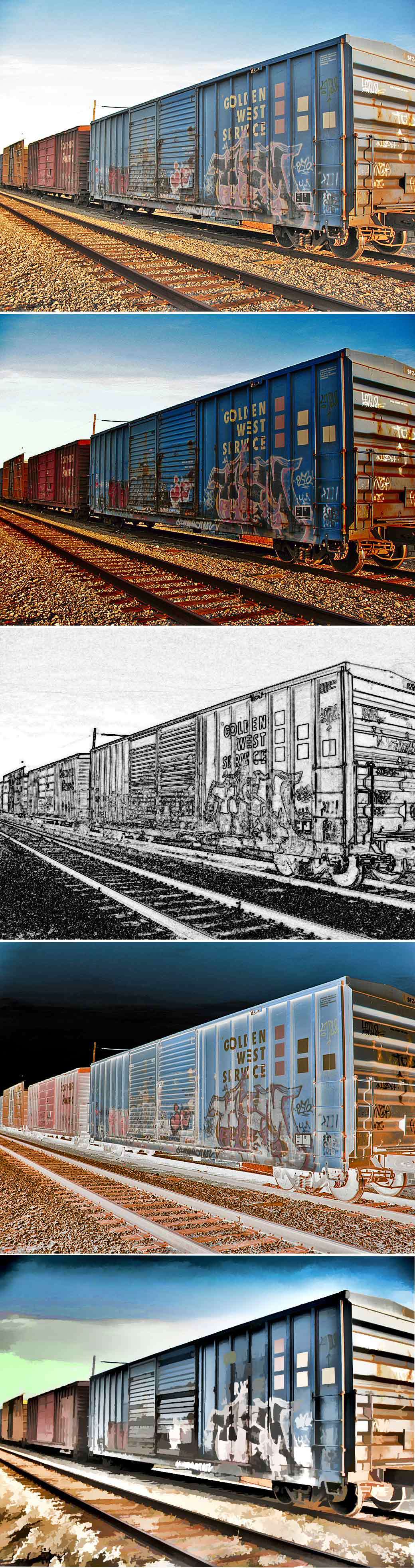
Railroad cars #2 - with variations by goodoleboy
Close
Hover over top left image to zoom.
Click anywhere to exit.
Members remain the original copyright holder in all their materials here at Renderosity. Use of any of their material inconsistent with the terms and conditions set forth is prohibited and is considered an infringement of the copyrights of the respective holders unless specially stated otherwise.
No AI - This artwork was created entirely by hand or with traditional digital tools.
Description
Tons of graffiti on most of the cars I see.
Captured back on 1/15/08, next to RR tracks I don't remember the location of.
Original on top.
Ciao.

Comments (3)
I have seen a lot of grafitti on railcars too, especially when on cross-country trips and seeing those long, long, LONG trains out in the middle of nowhere. You have taken it to a true art form with your variations in this presentation, Harry; bravo!
Fantastic capture and great manipulation... Fantastic tag also !!!
I'm not sure what Yves meant by "fantastic tag"---maybe it's a French term, but I did look to see what he could be referring to. But I agree with him and Denise on this, and how you take graffiti-laden trains to an art form. The first shot shows a good swath of that front-most car, and a good shot of the wild graffiti on it---not to mention the writing on the back of the car. And the light (you didn't say what time of day this was, but I have to assume it was either early or late, by the golden tinge to the light) makes it appear nostalgic and gold-tinged. Lots of track and rail bed in the shot---beautifully balanced from sky to gravel---with beautiful golden tones. The second one intensified everything, with deeper blues, deeper rusts, deeper golds and browns, lots of red coming out, and a deeper sky. This is the kind of sequence I often use in my panel-pieces, btw (intensifying as I go down). 3 goes a whole other direction with a highly analytic view, edges brought to the fore, an atomized view, bringing out the intense line-language of rail yards and their trains. It could be a pen and ink drawing. (And it's always nice to have black and white in a long color montage---it's your middle piece here, your "anchor".) 4 looks like it's inverted, but maybe not totally. In any case the highlighted shadows and intense 'night' sky brings out not just the graffiti, but the eerie inner-lit presence of the tracks. Some sophisticated color-swapping here, and the rail bed looks even more like a gravel abstract. And 5 seems one of your more unused treatments, if I recall correctly: You've broken the forms into colonies of shapes and edges, and switched the colors so that darks become light and vice versa. Those squares on the train-side are now quite bright. And all these cutout shapes make this an abstract painting---and I also love what you did with the sky. A very rich 5-some, with a fine original to begin with. And more of your exploration of the poetry of the rails. (You'd have a heyday in Chicago, with our huuuuuuge rail yards.) Fine and painstaking work, Harry.