











The Yellow Bikini (for renmmk) by MrGorf

Close
Hover over top left image to zoom.
Click anywhere to exit.
Members remain the original copyright holder in all their materials here at Renderosity. Use of any of their material inconsistent with the terms and conditions set forth is prohibited and is considered an infringement of the copyrights of the respective holders unless specially stated otherwise.
No AI - This artwork was created entirely by hand or with traditional digital tools.
Description
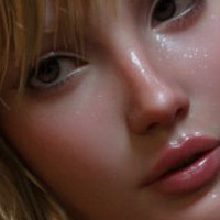
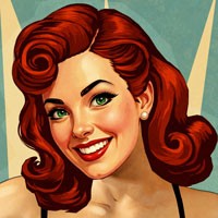
I wanted to demonstrate something I was discussing with "renmmk" recently. This picture is not necessarily good or bad, but is an illustration of an idea.
Now, there is nothing wrong with a super high contrast image, unless that's not what you want and it ends up that way anyway! This picture represents a full range of tones but nothing getting "blown out" on the bright end of the scale.
We're working in PaintShop Pro here... I've included a shot of the histogram showing the red channel, which in this (and many) pictures, has the highest values. You may want to zoom in to look at it. The left side of the histogram is black/0, the right is the highest recordable value/255. There is a "spike" at the lowest value, which is because of the pure black background. Note that it tapers off and does not spike at the bright end of the scale. For an image with a full range of tones but nothing over the top, this is generally what a histogram "should" look like.
About how this was made: in DAZ Studio, I used the one area light plane as the "key light." Then I added an UberEnvironment for the "fill" and set it to 25% intensity (no texture map) and Occlusion with Soft Shadows. This prevented everything except the background from falling into pure black.
In PaintShop Pro, I had to reduce the saturation significantly: by 35 points. Then I used Curves to bring the contrast up to the level you see here. Note that when you increase the contrast, the saturation usually goes up with it, hence why I lowered it.
Curves are a complex subject and I suggest anyone interested find a tutorial on the web. It is definitely a topic worth learning about. If you don't feel confident with Curves, try Levels. If you don't feel confident with Levels, try an auto adjustment, but that may or may not give you what you want.
Looking around the gallery here, a common problem I see is that of an image being too dark, with nothing in the picture going over the 50% brightness mark. Looking at a histogram will alert you to this immediately.
I hope this was useful information. Remember, in art, there is no right or wrong, but there is doing what you want versus something just happening and not knowing how to change it.
Final thought: do not trust your eyes. Do not trust your monitor. Trust the histogram!

Comments (5)
Very good image and interesting narrative thanks for the enlightenment
Excellent!!
many many thanks!
Lovely
Excellent description. Thanks!! ;-)