
brycetech opened this issue on Jan 13, 2006 · 17 posts
brycetech posted Fri, 13 January 2006 at 11:31 PM

ShawnDriscoll posted Sat, 14 January 2006 at 1:32 AM
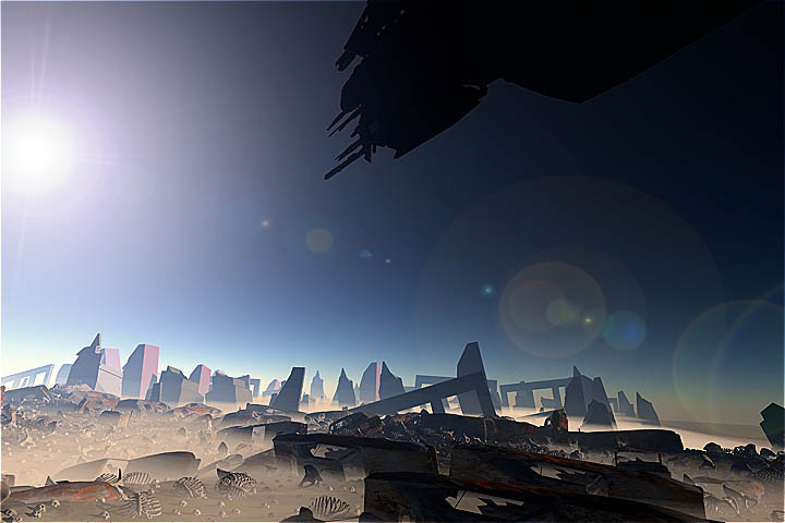
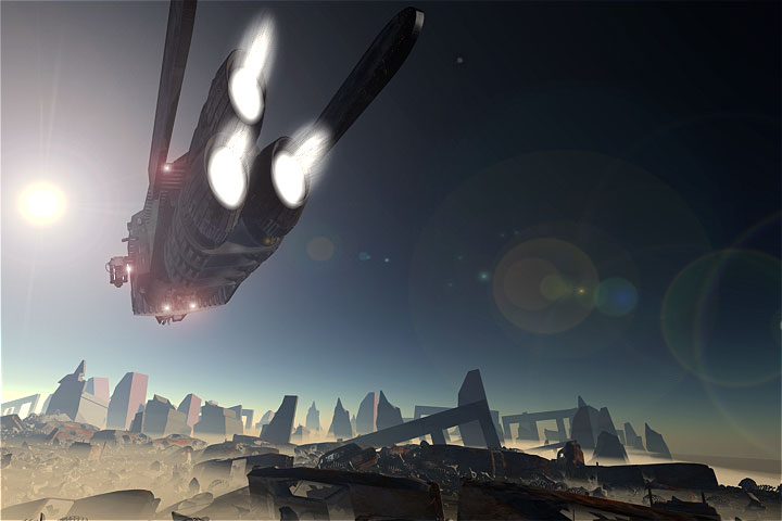
All the skulls are facing upward. Is there a way to fix that?

hdaggers posted Sat, 14 January 2006 at 11:08 AM
That's cause everybody died standing while looking in the same direction (presumably the killing spaceship). Then physics just plopped them down on the ground. Besides, If the empty sockets weren't facing the camera they'd just appear to be be white rocks.... ;^P Great image BT!

steama posted Sat, 14 January 2006 at 12:08 PM
Wow, I like that image. Very cool BT.
brycetech posted Sat, 14 January 2006 at 6:42 PM
ShawnDriscoll posted Sat, 14 January 2006 at 7:57 PM
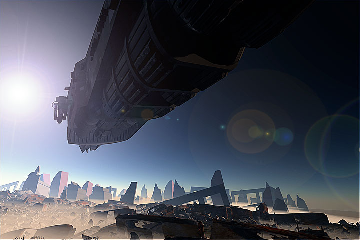
Are there two stars for this planet? There seems to be light coming from the right side.

ren_mem posted Sat, 14 January 2006 at 9:48 PM
Very cool Brycetech. We'd all love to see how you did it(hint hint)I actually find the cartoony vs real sky interesting.
No need to think outside the box....
Just make it
invisible.
brycetech posted Sat, 14 January 2006 at 10:24 PM
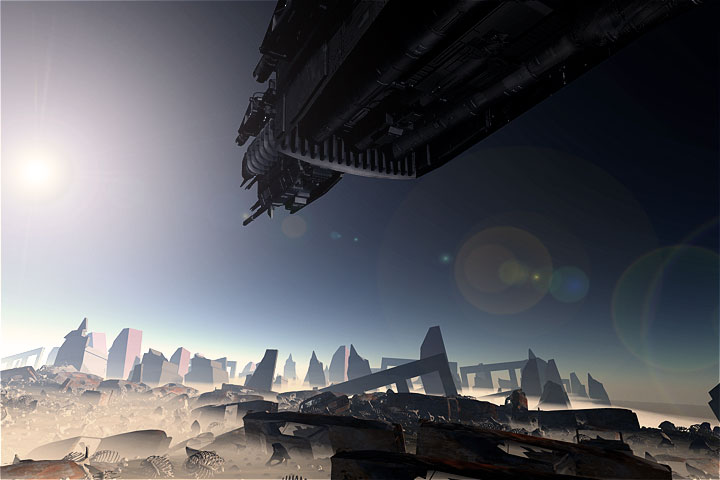
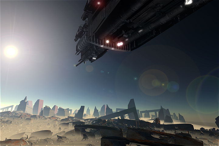
that should be reduced in the shadow pass shonner :)..if not...shrug... there will also be a "lighting" pass where lights on the ship will be rendered and composited in. That'll either help (or hurt) the current lighting setup. I hope the shadows dont remove too much detail from the ship which is why there are lights around the ship to show the detail. In C's original render (at the top) you cant see any of the very extreme detail of the spaceship. As this finishes, that should be visible and also the extra things be there as well. :) I'll reduce the saturation in the final image after everything is done to reduce the "cartoonish" look of the sky. Interestingly enough, this is a default "realistic sky" that comes with C5 pro. Not too realistic, but interesing... this is all part of an experiment. Ive read about about the multiple passes for renders that are then composited because this gives greater control of the final image at the end. A default render, a beauty pass (all the textures), a shadow(a gray model with bright lights) , a highlight (a gray model with bright lights), and a lighting pass. All composited together in a video editor where you can vary the opacity easily of each pass and also mask out other things. It interesting to see the control that this method offers and I can see why some studios do it this way. :) more coming soon BT
brycetech posted Sat, 14 January 2006 at 11:23 PM

bwtr posted Sun, 15 January 2006 at 12:39 AM
Brycetech I find this all very intruiging but way out of my league. I hope you will follow through with a movie of the final results--including these steps you are showing--through to the end. Please!
bwtr
ShawnDriscoll posted Sun, 15 January 2006 at 12:49 AM
Ok. I thought the images had all their render passes combined already.
ren_mem posted Sun, 15 January 2006 at 11:04 AM
Are you using Baker? Actually, I was referring to the fact that the sky looks more realistic than the ground objects.Sounds like a good project. You might have to try camera tracking next :D
No need to think outside the box....
Just make it
invisible.
brycetech posted Sun, 15 January 2006 at 11:20 PM

Kixum posted Mon, 16 January 2006 at 7:28 AM
It looks really great! What a fanstastic "experiment"! -Kix
-Kix
brycetech posted Mon, 16 January 2006 at 1:07 PM
ren_mem posted Mon, 16 January 2006 at 2:40 PM
I have noticed a problem with naming the file in BQ if it already exists also. Hadn't got a chance to check it again yet.
No need to think outside the box....
Just make it
invisible.

cjd posted Tue, 17 January 2006 at 5:00 AM
brycetech, So if the "stones" are skulls, then the "slinkies" must be ribs? :) You mentioned this is part of an animation going to DVD. Can you comment on what the DVD will be? (Sorry if you mentioned this already, but I may have missed it.) Superb work, hope we all get to see the finished animation. Chris