msansing opened this issue on May 19, 2026 · 11 posts
oaiki posted Fri, 03 July 2026 at 10:51 AM
oaiki posted at 8:05 AM Fri, 3 July 2026 - #4507992
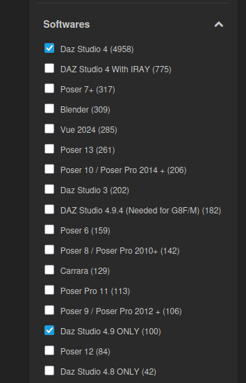
**I'm talking about the content filters at the side on the product listing, not the one in the banner:Nice to have a new look to the freebies page and I like that the team makes updates without breaking functionality; but, 3 big banners before you actually get to the content list?
At first I thought the middle 'Trending' banner was the actual and "only" content available ... if you want that banner, shrink the contents and put it in a carousel so that it is obvious that it is a taster.
Also the "software" filter** is too long, detailed and unsorted, shouldn't it be like the "marketplace" software filter which groups software variants under a generic name and if required expands for more detail?